Examples
If you do not yet have ChiRP installed, you can do so using install_github() from devtools package:
#devtools::install_github('stablemarkets/ChiRP')
library(ChiRP)
Zero-Inflated Regression
Here we’ll demonstrate how to train and predict using a Chinese Restaurant Process (CRP) mixture of zero-inflated regressions. Let’s generate some fake data first.
set.seed(1)
n<-200 ## generate from clustered, skewed, data distribution
X11 <- rnorm(n = n, mean = 10, sd = 3)
X12 <- rnorm(n = n, mean = 0, sd = 2)
X13 <- rnorm(n = n, mean = -10, sd = 4)

Y1 <- rnorm(n = n, mean = 100 + .5*X11, 20)*(1-rbinom(n, 1, prob = pnorm( -10 + 1*X11 ) ))
Y2 <- rnorm(n = n, mean = 200 + 1*X12, 30)*(1-rbinom(n, 1, prob = pnorm( 1 + .05*X12 ) ))
Y3 <- rnorm(n = n, mean = 300 + 2*X13, 40)*(1-rbinom(n, 1, prob = pnorm( -3 -.2*X13 ) ))

d <- data.frame(X1=c(X11, X12, X13), Y = c(Y1, Y2, Y3))

par(mfrow=c(1,2))
plot(d$X1, d$Y, pch=20)
hist(d$Y)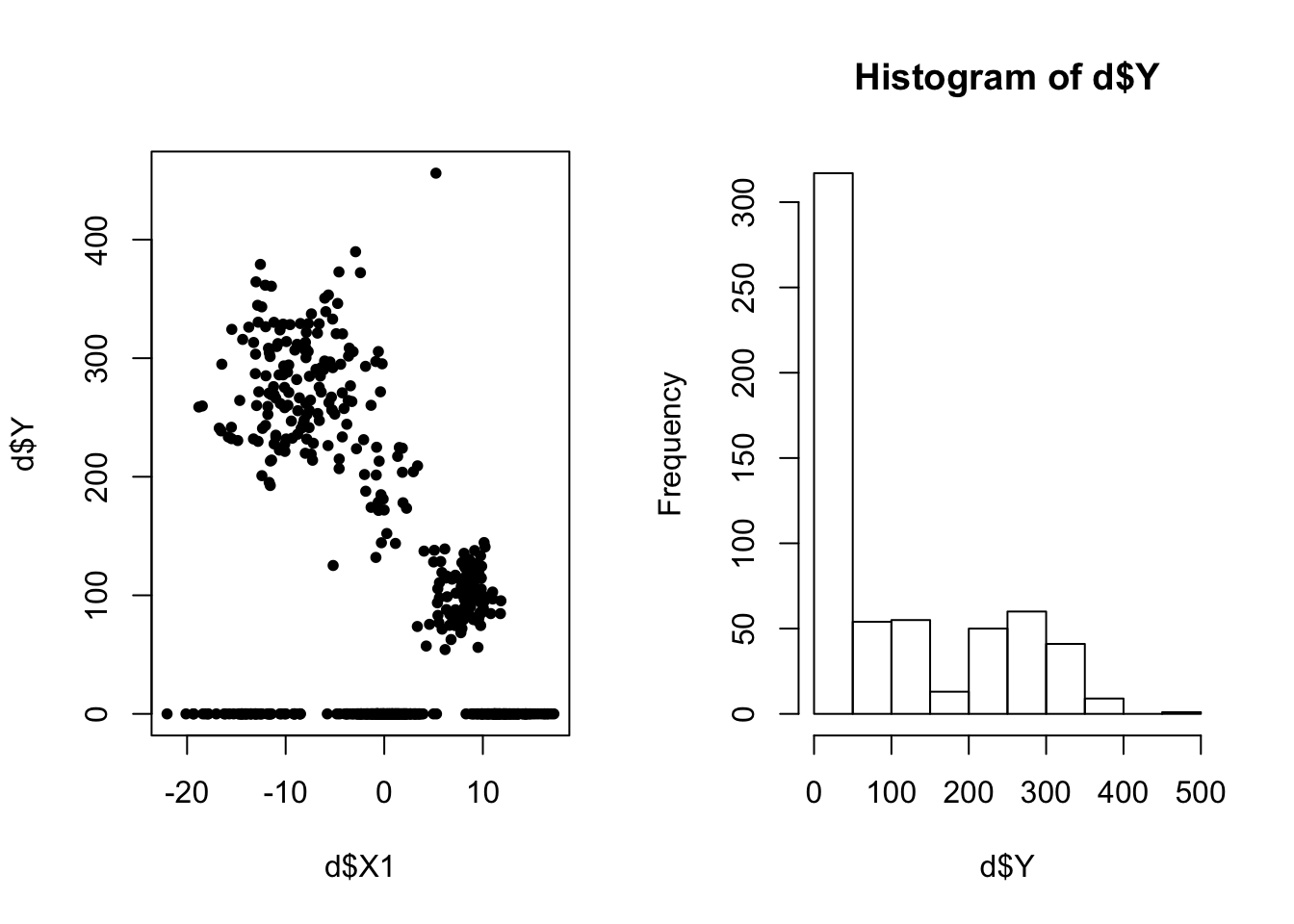
Let’s randomly partition the data into training and testing, train a model, and analyze the results. We run iter-burnin\(=1000\) post-burnin iterations. I choose a fairly flat prior for my data variance (phi_y - See the model details for an explanation). I initialize the sampler with init_k=5 clusters.
ids <- sample(1:600, size = 500, replace = F )

d$X1 <- scale(d$X1)

d_train <- d[ids,]
d_test <- d[-ids, ]

res <- ChiRP::ZDPMix(d_train = d_train, d_test = d_test, formula = Y ~ X1,
                     burnin=2000, iter=3000, init_k = 5, phi_y = c(10, 10000))
## Iteration 2 of 3000 (burn-in)
## Iteration 301 of 3000 (burn-in)
## Iteration 601 of 3000 (burn-in)
## Iteration 901 of 3000 (burn-in)
## Iteration 1201 of 3000 (burn-in)
## Iteration 1501 of 3000 (burn-in)
## Iteration 1801 of 3000 (burn-in)
## Iteration 2101 of 3000 (sampling)
## Iteration 2401 of 3000 (sampling)
## Iteration 2701 of 3000 (sampling)
## Sampling Complete.# compute the posterior model cluster assignment
train_clus <- ChiRP::cluster_assign_mode(res$cluster_inds$train)The results objects res is a list of two objects. The first, cluster_inds contains two matrices. First, cluster_inds$train is a matrix where each column is a posterior vector of cluster assignment indicators. Each column is the same length as the number of patients. Second, cluster_inds$test is the same matrix, but for the test set observations.
The function cluster_assign_mode take as input one of the cluster assignment matrices and computes the posterior mode assignment while correcting for label switching.
Now let’s plot some results:
par(mfrow=c(3,1))

# clustering results
plot(d_train$X1, d_train$Y, col=as.factor(train_clus$class_mem), pch=20,
     main='Posterior Mode Cluster Assignment')

# in-sample predictions
plot(d_train$X1, res$predictions$train[,1000], pch=20, col='gray',
     main='Posterior predictions (gray) with Observed values (black)')
points(d_train$X1, res$predictions$train[,999], pch=20, col='gray')
points(d_train$X1, d_train$Y, pch=20, col='black')

# out-of-sample test set predictions
plot(d_test$X1, res$predictions$test[,1000], pch=20, col='gray',
     main='Posterior predictions (gray) with Observed values (black)')
points(d_test$X1, res$predictions$test[,999], pch=20, col='gray')
points(d_test$X1, d_test$Y, pch=20, col='black')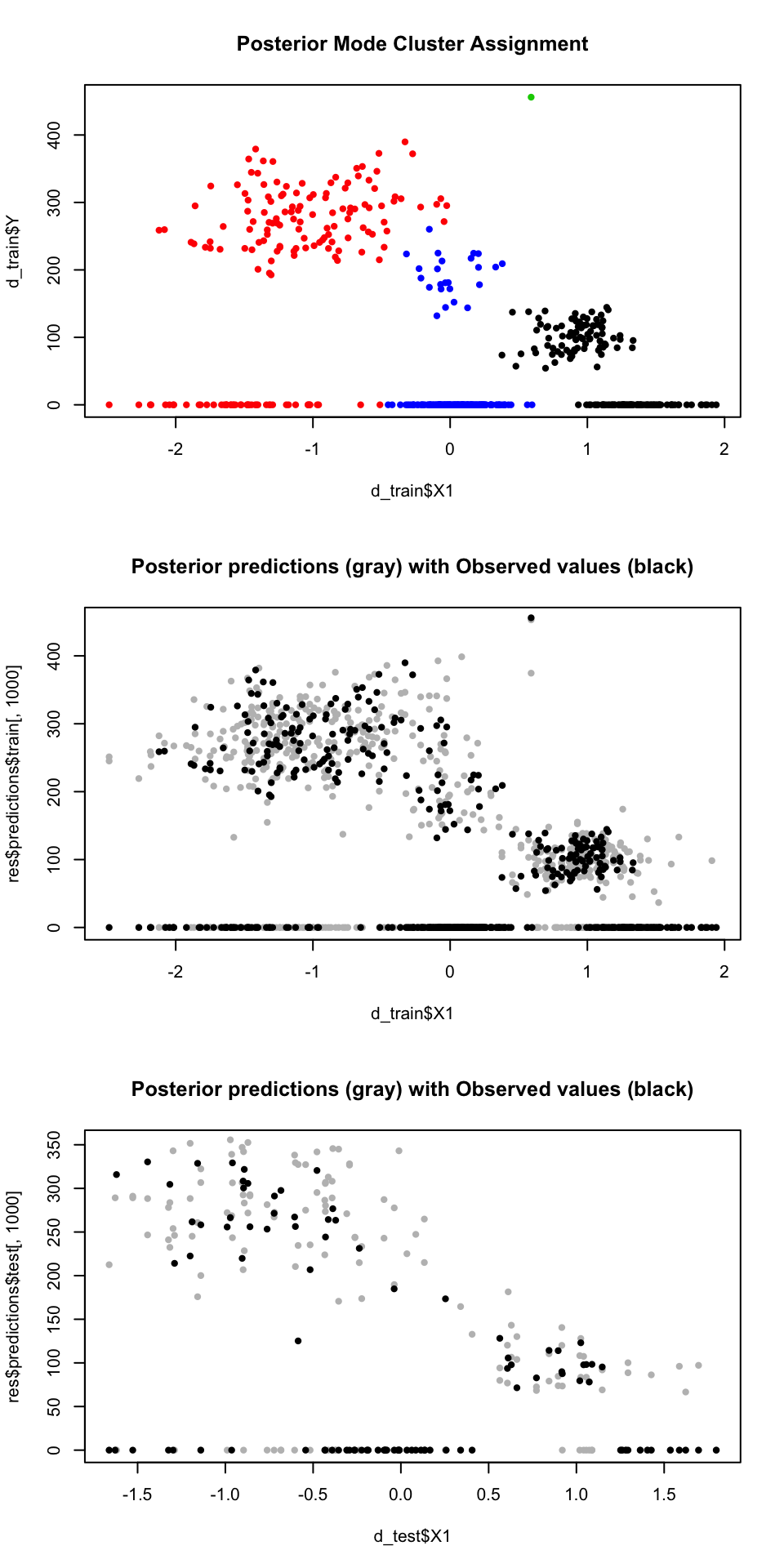
Notice that the DP model finds three distinct clusters each with it’s own amount of zero-inflation and other parameters. Because it partitions the complex data into more similar subgroups, the predictive distribution is really similar to the data.
Instead of doing a hard classification, we can visualize the posterior adjacency matrix which is output by cluster_assign_mode(). This matrix is \(n \times n\) - showing how often patient \(i\) was clustered with patient \(j\). Taking subjects to be nodes and these proportions to be vertex lengths, we can visualize this using a network:
# install.packages(igraph)
library(igraph)

par(mfrow=c(1,1))

g <- graph_from_adjacency_matrix(train_clus$adjmat, diag = F,mode='undirected', weighted=T)
coords <- layout.auto(g)

plot(g, layout=coords,vertex.size=5, vertex.label=NA,axes = F, edge.color='gray87',edge.width=1,
     vertex.color=ifelse(train_clus$class_mem=='c1', 'black',
                         ifelse(train_clus$class_mem=='c8', 'red',
                                ifelse(train_clus$class_mem=='c561','green','blue'))) )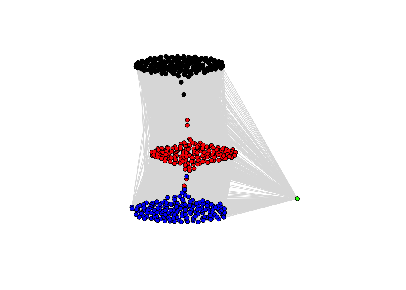
This is helpful for visualizing the uncertainty in posterior cluster assignments. Points between two clumps represent subjects who frequently switched between the two clusters…thus there is significant uncertainty about with whom they belong.
Gaussian Regression
Now let’s look at the NDPMix() function for implementing a Gaussian regression (no zero inflation).
Sin() Wave
Let’s simulate some wonky data:
n <- 200
set.seed(3)

# training
x<-seq(1,10*pi, length.out = n) # confounder
y<-rnorm( n = length(x), sin(.5*x), .07*x)
d <- data.frame(x=x, y=y)
d$x <- scale(d$x)
plot(d$x,d$y, pch=20)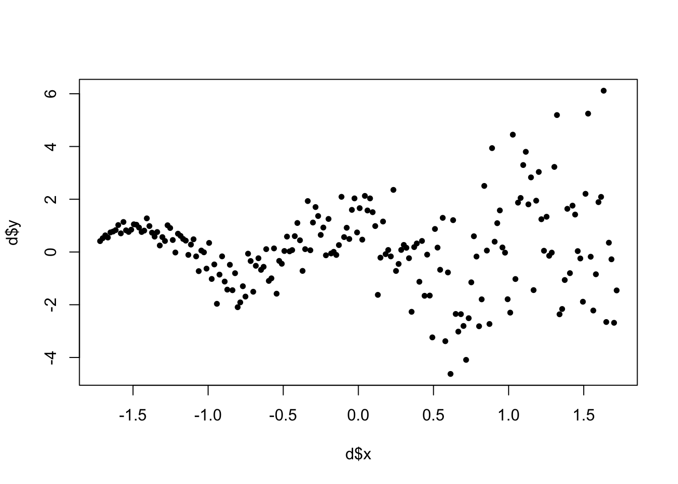
#test
d_test <- data.frame(x=seq(1.5,2,.01))
The syntax for NDPMix() is analagous to ZDPMix():
set.seed(1)
NDP_res<-NDPMix(d_train = d, d_test = d_test,
                formula = y ~ x,
                burnin=4000, iter = 5000,
                phi_y = c(5,10), beta_var_scale = 10000,
                init_k = 10, mu_scale = 2, tau_scale = .001)
## Iteration 2 of 5000 (burn-in)
## Iteration 501 of 5000 (burn-in)
## Iteration 1001 of 5000 (burn-in)
## Iteration 1501 of 5000 (burn-in)
## Iteration 2001 of 5000 (burn-in)
## Iteration 2501 of 5000 (burn-in)
## Iteration 3001 of 5000 (burn-in)
## Iteration 3501 of 5000 (burn-in)
## Iteration 4001 of 5000 (sampling)
## Iteration 4501 of 5000 (sampling)
## Sampling Complete.tt <- cluster_assign_mode(NDP_res$cluster_inds$train)
plot(d$x, d$y, col=as.factor(tt$class_mem),pch=20 )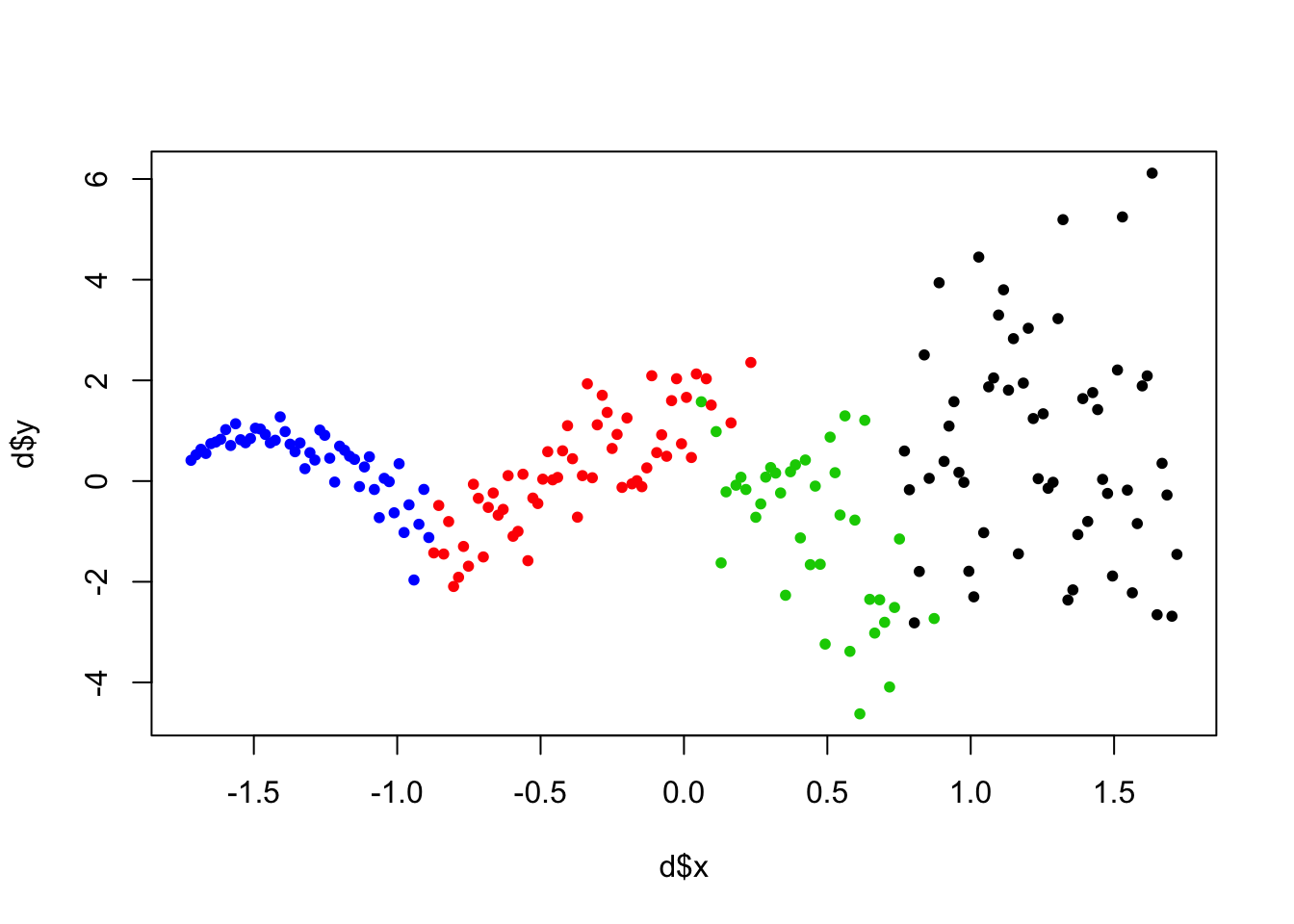
The clustering the DP found is really interesting. Notice we initialize with init_k=10 clusters, but the DP detects fewer homogenous subgroups. In this setting, clustering may just a means to an end: we care about the clustering because we want good predictions.
So let’s see how the predictions do:
par(mfrow=c(1,1))
## plot observed data
plot(d$x, d$y, pch=20, ylim=c(-10,10), xlim=c(min(d$x), 2))

# plot 100 posterior predictive draws on the training set
for(i in 900:1000){
  points(d$x, NDP_res$predictions$train[,i], col='gray', pch=20)
}
points(d$x, d$y, pch=20) # overlay data

# plot posterior predictive mean on training.
points(d$x, rowMeans(NDP_res$predictions$train), col='blue', pch=20)

# plot posterior predictive mean on test set.
points(d_test$x, rowMeans(NDP_res$predictions$test), col='red', pch=20)
legend('topleft', legend = c('Training Data','Predictive Draws',
                             'Predictive Mean (training)','Predictive Mean (test)' ),
       col=c('black','gray','blue','red'), pch=c(20,20,20,20))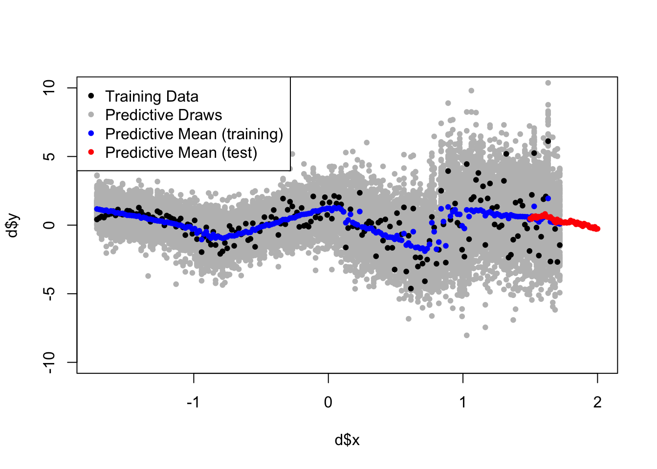
Iris
One more clustering example using the Iris dataset.
# it helps to normalize continuous variables.
iris <- iris
iris$Sepal.Width <- as.vector(scale(iris$Sepal.Width))
iris$Petal.Width <- as.vector(scale(iris$Petal.Width))
iris$Petal.Length <- as.vector(scale(iris$Petal.Length))
iris$Sepal.Length <- as.vector(scale(iris$Sepal.Length))

# run DP Gaussian
set.seed(3)
iris_res<-NDPMix(d_train = iris, d_test = iris,
                  formula = Sepal.Length ~ Sepal.Width + Petal.Length + Petal.Width,
                  burnin=3000, iter = 4000,phi_y = c(5,1),
                  beta_var_scale = 10000, init_k=5, mu_scale = 1, tau_scale = .5)
## Iteration 2 of 4000 (burn-in)
## Iteration 401 of 4000 (burn-in)
## Iteration 801 of 4000 (burn-in)
## Iteration 1201 of 4000 (burn-in)
## Iteration 1601 of 4000 (burn-in)
## Iteration 2001 of 4000 (burn-in)
## Iteration 2401 of 4000 (burn-in)
## Iteration 2801 of 4000 (burn-in)
## Iteration 3201 of 4000 (sampling)
## Iteration 3601 of 4000 (sampling)
## Sampling Complete.# get posterior mode clustering
clust_res <- ChiRP::cluster_assign_mode(iris_res$cluster_inds$train)
par(mfrow=c(1,2))
plot(iris$Petal.Width, iris$Sepal.Length, col=as.factor(clust_res$class_mem),pch=20,
main='Colors = Detected CLusters')
plot(iris$Petal.Width, iris$Sepal.Length, col=as.factor(iris$Species),pch=20,
main='Colors = True Species Indicator')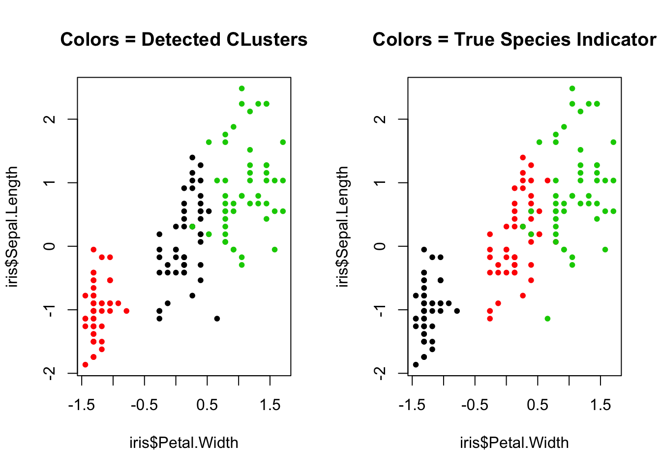
Logit Regression Example
In this section we look at an example using PDPMix() - a Chinese Restaurant Process mixture of logistic regressions. Let’s simulate binary outcomes from two distinct clusters
set.seed(1)
n<-1000 # simulate 1000 subjects

# Cluster 1: 5 continuous covariates with mean 5, variance 5
x1 <- replicate(2,  rnorm(n/2, 10, 5) )

# Cluster 2: 5 continuous covariates with mean 5, variance 5
x2 <- replicate(2,  rnorm(n/2, -10, 5))

# outcome for both clusters
y <- numeric(length = n)
y[1:500] <- rbinom(500, 1, pnorm(-5 + x1 %*% matrix(c(-2,2), ncol=1) )  )
y[501:1000] <- rbinom(500, 1, pnorm(5 + x2 %*% matrix(c(2,-2), ncol=1)  ) )

# combine into data.frame
d <- data.frame(rbind(x1,x2), y)

# normalize covariates...helps for numerical stability.
d$X1 <- scale(d$X1)
d$X2 <- scale(d$X2)

head(d)
## X1 X2 y
## 1 0.6052816 0.9363886 1
## 2 0.9648403 0.7707322 0
## 3 0.5124401 0.3783095 0
## 4 1.5913907 0.9071639 0
## 5 1.0295818 1.3411743 1
## 6 0.5191689 1.6078590 1Now let’s run the regresison. For the logistic regression parameters, I use null centered prior for my coefficient vector beta_prior_mean = rep(0,6). Prior variance around this empirical mean is fairly wide (on an odds ratio scale) priors for each parameter beta_prior_var = rep(2, 6). All continous covariates are widely centered around empirical means: tau_scale = 3, mu_scale = 3. See the Model Description page for detailed explanations behind these parameters. Roughly speaking, these parameters control how far new cluster parameters can be dispersed around the empirical parameters. If they are too narrow, new occupied clusters will be introduced too often and the model may overfit. If they are too wide, new occupied clusters will not form often enough and the model fit will be bad.
I take a total of iter=2000 posterior draws but toss the first burnin=1000 draws.
set.seed(100)

# split data into training (800 obs) and testing (200 obs)
test_ids <- sample(1:1000, 200, F)
d_test <- d[test_ids, ]
d_train <- d[-test_ids, ]

logit_res <- PDPMix(d_train = d_train, d_test = d_test,
                     formula = y ~ X1 + X2,
                     burnin = 4000, iter = 5000,
                     beta_prior_var = rep(3, 3), # fairly flat priors
                     beta_prior_mean = rep(0,3), # null centered priors
                     prop_sigma_b = diag(rep(.001, 3)) , # proposal covariance
                     init_k = 5, tau_scale = 3, mu_scale = 3)
## Iteration 2 of 5000 (burn-in)
## Iteration 501 of 5000 (burn-in)
## Iteration 1001 of 5000 (burn-in)
## Iteration 1501 of 5000 (burn-in)
## Iteration 2001 of 5000 (burn-in)
## Iteration 2501 of 5000 (burn-in)
## Iteration 3001 of 5000 (burn-in)
## Iteration 3501 of 5000 (burn-in)
## Iteration 4001 of 5000 (sampling)
## Iteration 4501 of 5000 (sampling)
## Sampling Complete.post_pred_train <- rowMeans(logit_res$predictions$train)
post_pred_test <- rowMeans(logit_res$predictions$test) First let’s do some posterior predictive checks against the data to assess model fit.
boxplot(post_pred_train ~ d_train$y)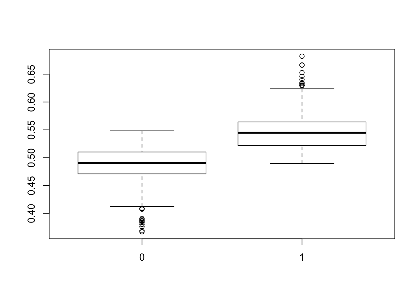
This looks okay. The events are well-separated in the training set. Let’s look at the MCMC chain for the marginal probability of the event…it oscillates around the marginal probability observed in the training data (indicated by the red line).
plot(colMeans(logit_res$predictions$train), type='l' )
abline(h=mean(d_train$y), col='red')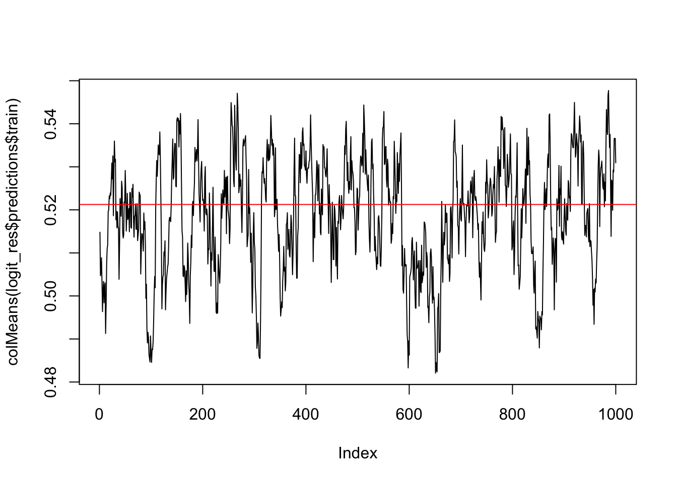
This indicates an okay fit…should other sensible posterior predictive checks should be done as well. E.g. summarize observed and posterior mean probabilities within levels of covariates (deciles for numeric ones) is also sensible.
Let’s use the pROC package to plot the ROC curve in the training and testing dataset. This is a fully Bayesian method, so we actually have 1000 posterior ROC curves - yielding 1000 posterior AUCs, sensitivities, and specificities, etc. Let’s go ahead and compute the ROC associated with the posterior mean probability for each subject.
library(pROC)

par(mfrow=c(1,2))
## plot ROC curves (posterior draws and mean) for training set
plot.roc(d_train$y, post_pred_train,
         main='ROC - CRP logistic')
## plot ROC curves (posterior draws and mean) for test set
lines.roc(d_test$y, post_pred_test, col='red')
legend('bottomright',legend=c('Training','Test'), col=c('black', 'red'), lty=c(1,1))


## get ROC from parametric logistic regresison for comparison
param_mod <- glm(data = d_train, formula = y ~ X1 + X2 + X1*X2,
                 family = binomial('logit'))

plot.roc(d_train$y,
         predict(param_mod,newdata = d_train, type = 'response'),
         main='ROC - Parametric logistic')
lines.roc(d_test$y,
          predict(param_mod,newdata = d_test, type = 'response'),
          col='red')
legend('bottomright',legend=c('Training','Test'), col=c('black', 'red'), lty=c(1,1))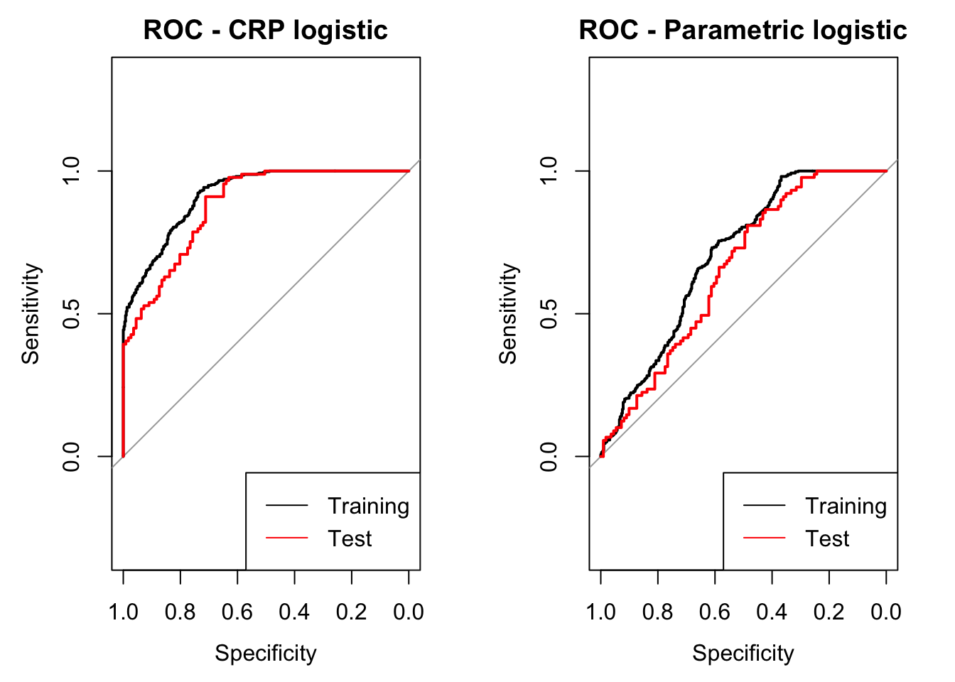
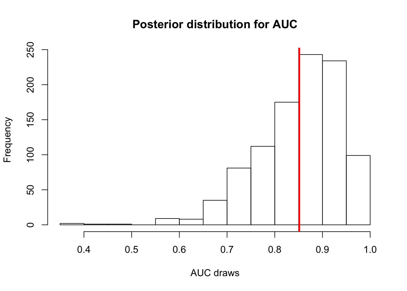
Let’s plot the posterior distribution for AUC.
auc_post_dist <- numeric(length = 1000)
for(i in 1:1000){
  auc_post_dist[i] <- pROC::auc(d_train$y, logit_res$predictions$train[,i])
}

hist(auc_post_dist, main='Posterior distribution for AUC', xlab='AUC draws')
abline(v=mean(auc_post_dist), col='red', lwd=3) # posterior mean AUC